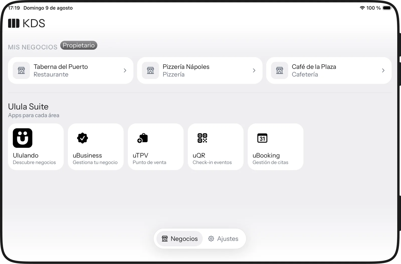
uKDS.
Kitchen display
What is still to be charged, what is waiting, what is being cooked and what is going out. One tap moves the ticket and the whole kitchen sees it.
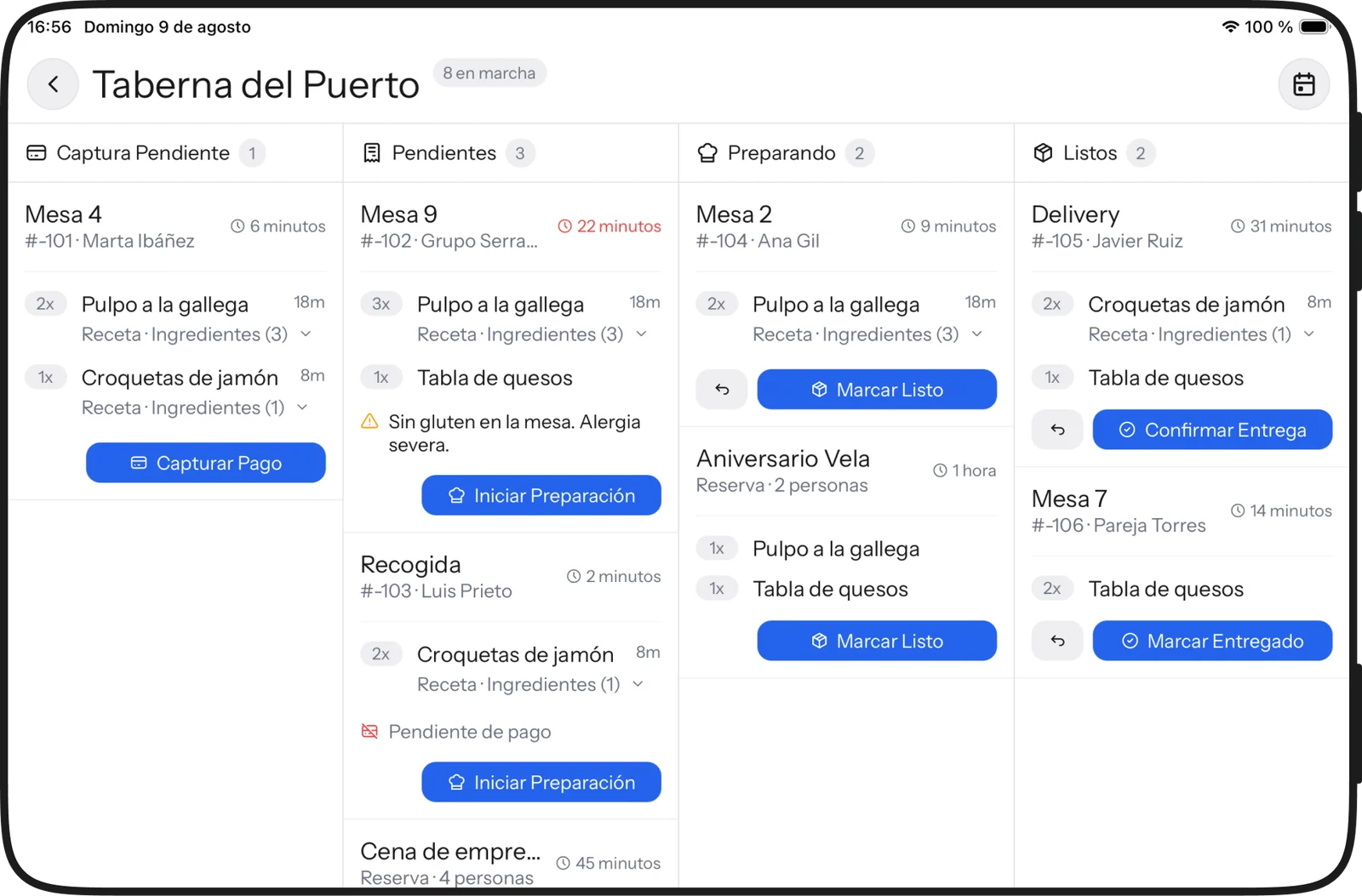
Why a tablet and not a phone
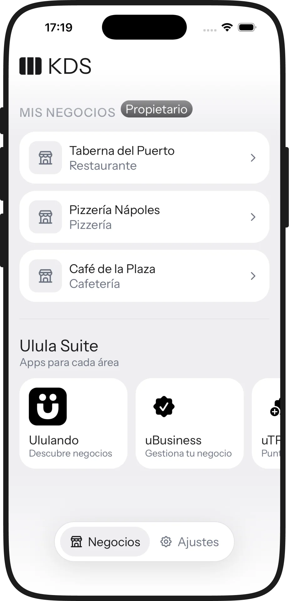
The point of the pass is that four columns are visible AT ONCE. A portrait screen can only ever show one, and a kitchen isn’t run by flicking through tabs: that’s why the app is landscape first and the phone is the exception, for the station without a screen of its own.
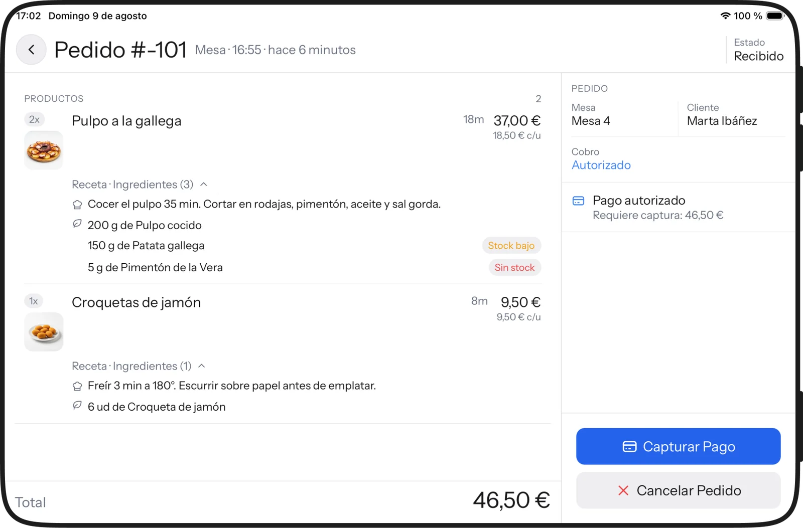
The recipe, under the dish
Every line opens its steps and its ingredients with the quantities from the costing, and says so when something is running low. An allergy isn’t a discreet icon: it takes up room on the ticket, because it’s the one thing on that screen nobody can miss.
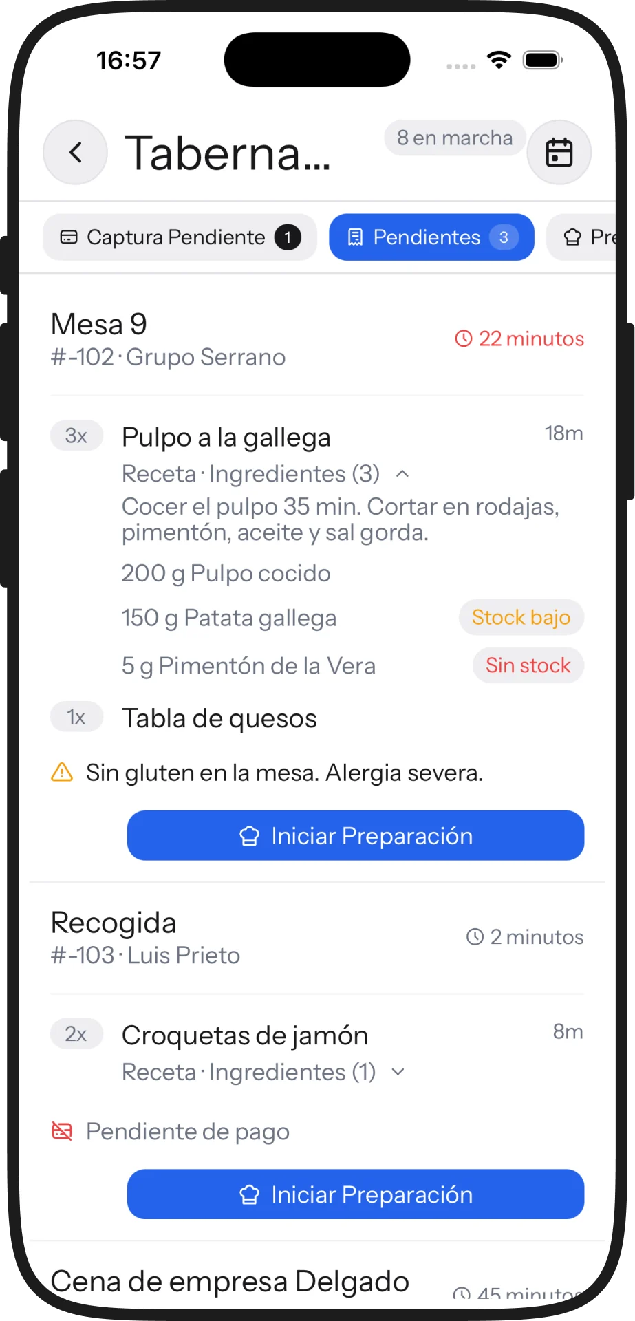
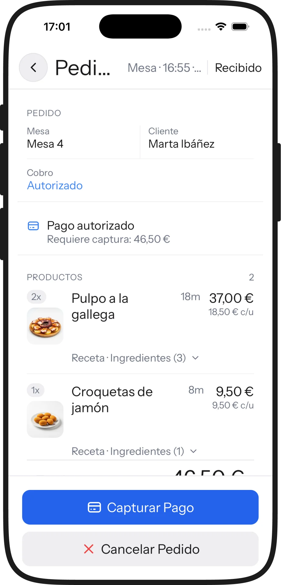
- ✓Tickets from the till, the app and delivery in one queue
- ✓Recipe and ingredients with costing quantities
- ✓Visible allergens and low-stock warnings
- ✓Timers per ticket and per line
- ✓Multi-station and several venues
It shares its backend, design system and account with the rest of the suite. The full context —architecture, integrations, business model— lives in the Ulula case study.
Screen by screen