ululando.
Discovery app
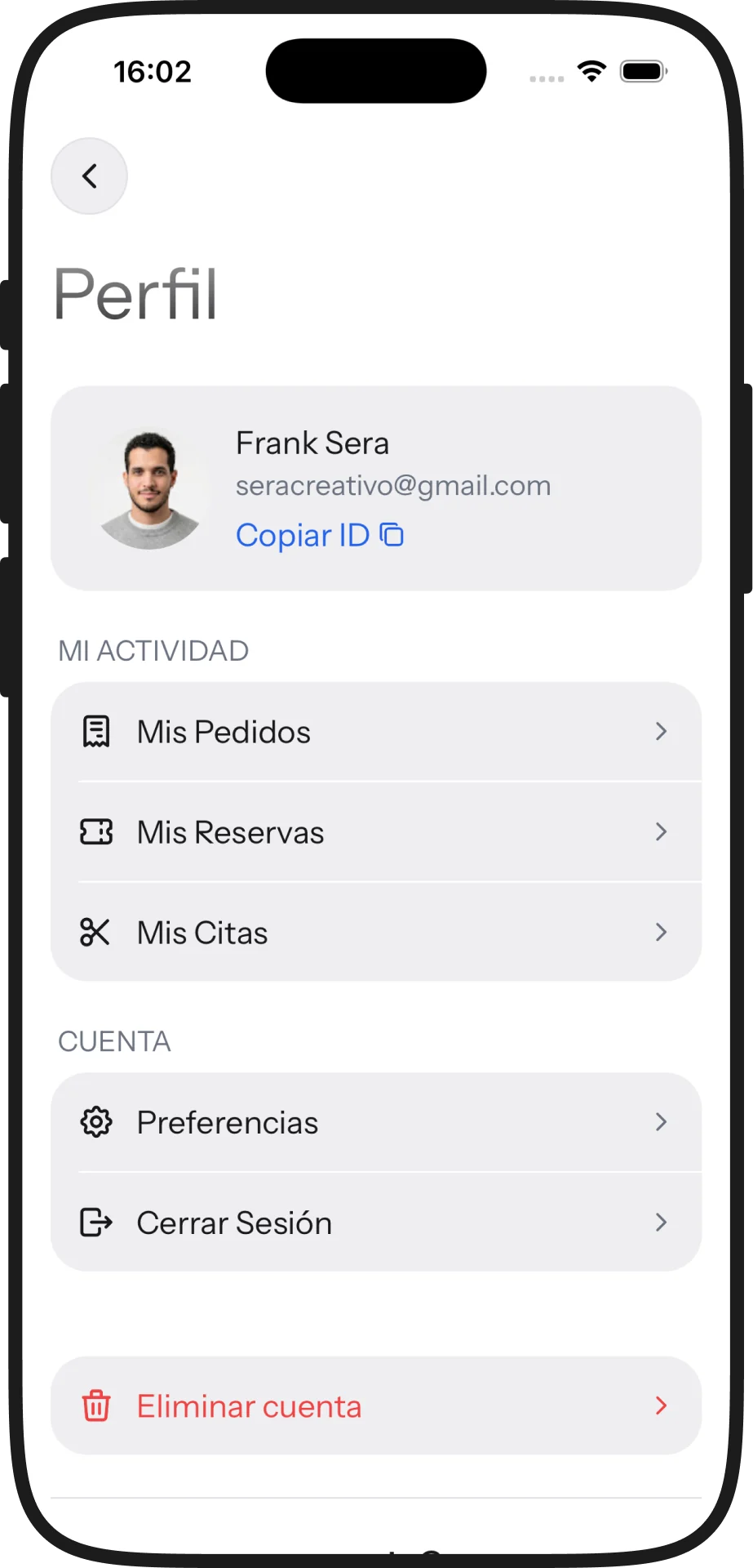
Everything the other three apps produce —a table, an appointment, a dish, a ticket— lands here. This is the customer’s side, and the one that decides whether the suite makes sense beyond the counter.

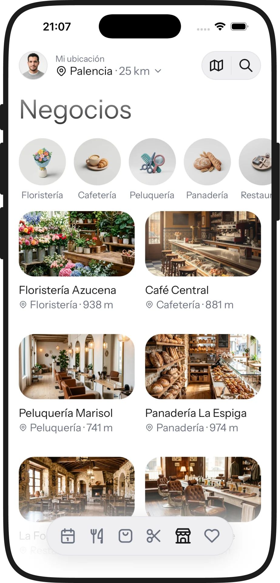
The businesses in your city, not a directory’s
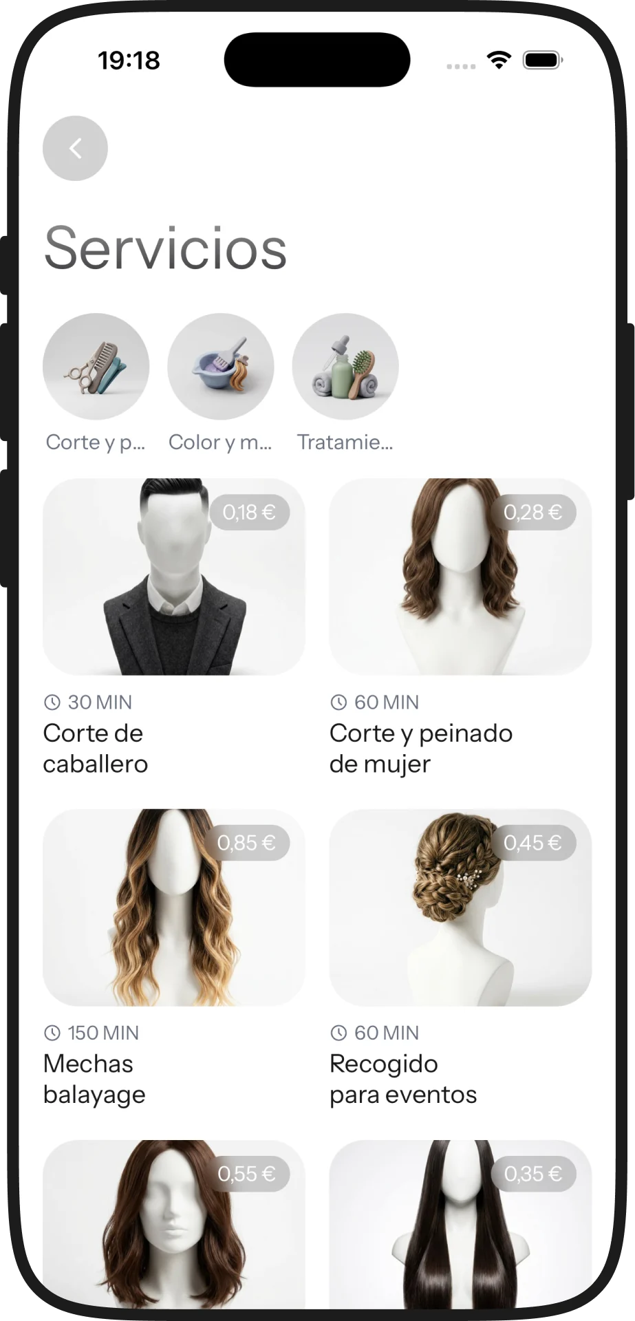
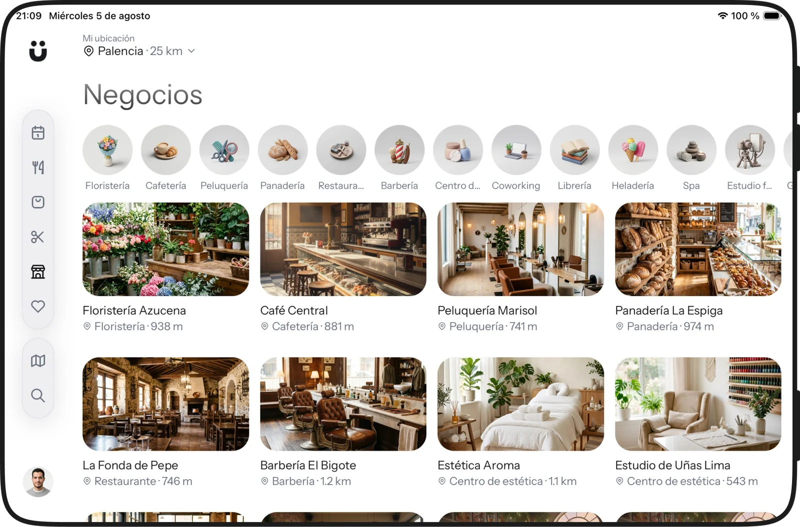
Florists, cafés, hair salons, bakeries: what’s actually within reach, sorted by distance, with everything it offers up front. Not a directory of dead listings — every business arrives with its menu, its services, its events and its shop, because they come from the same suite it uses behind the counter.
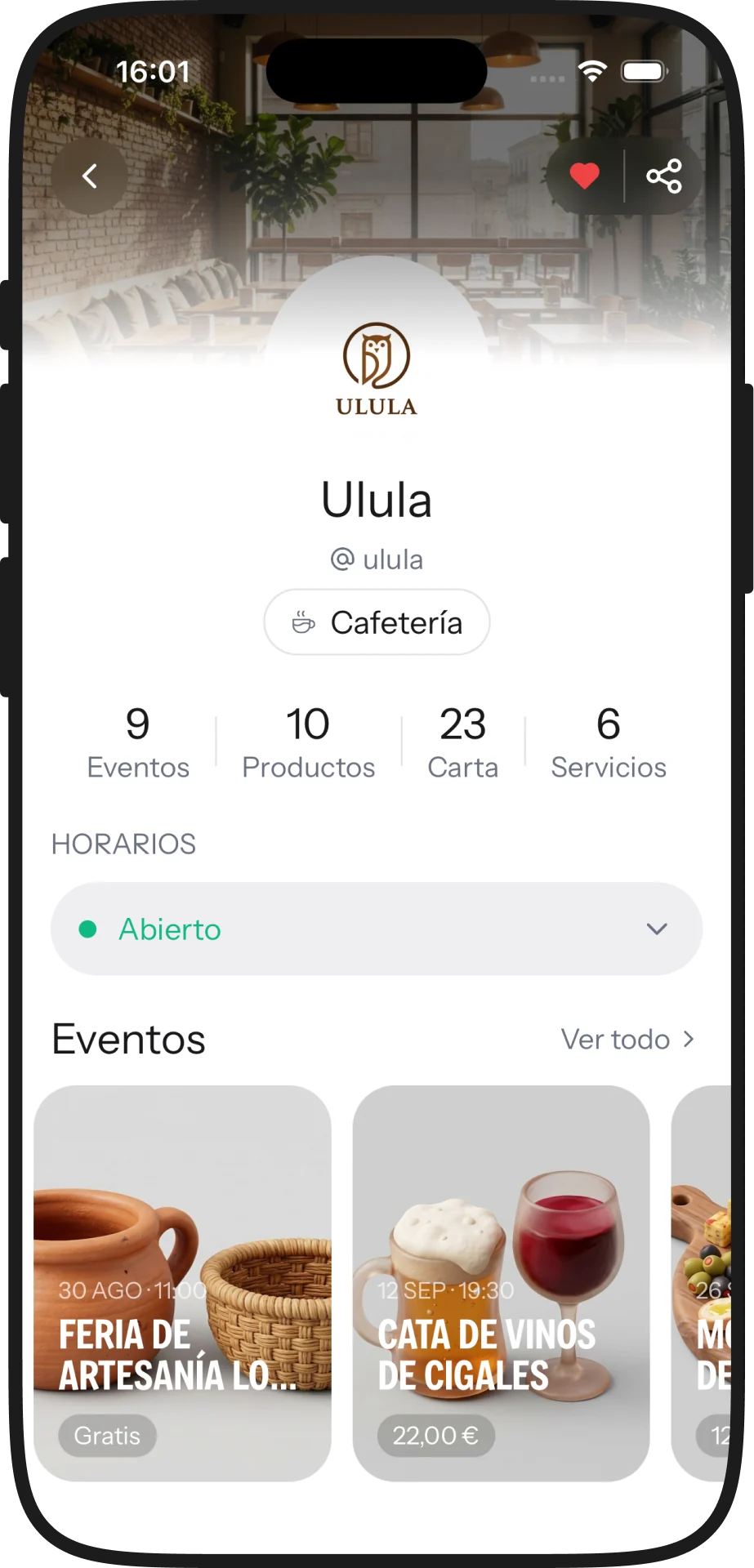
A seat, in three taps
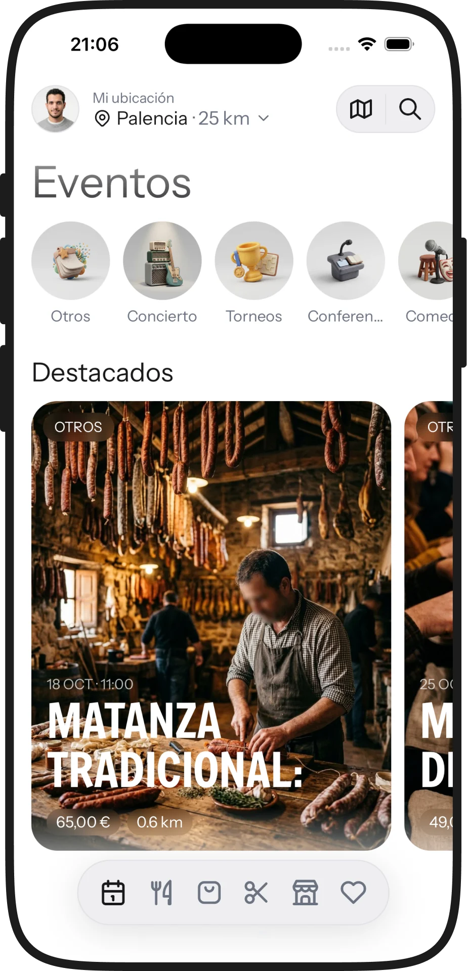
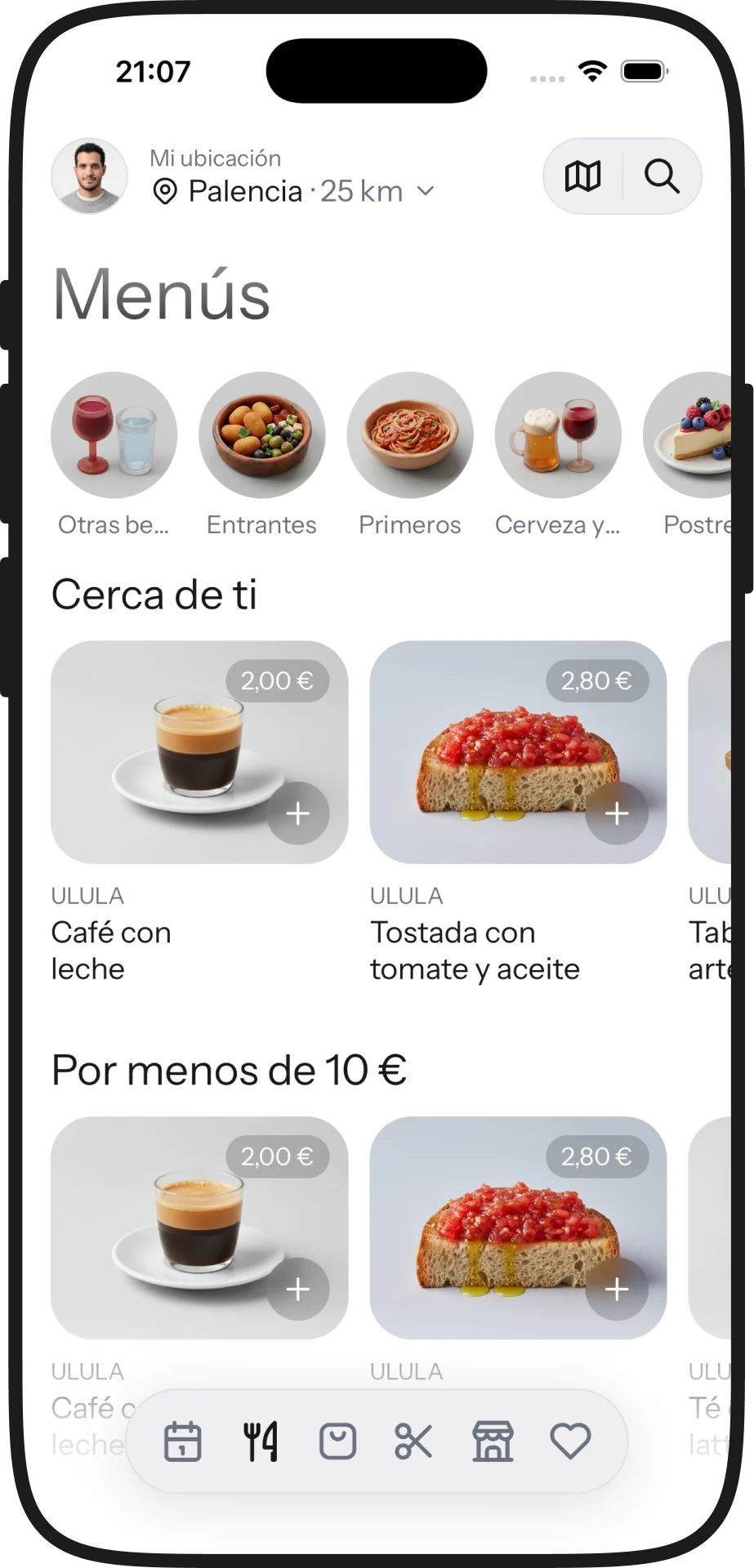
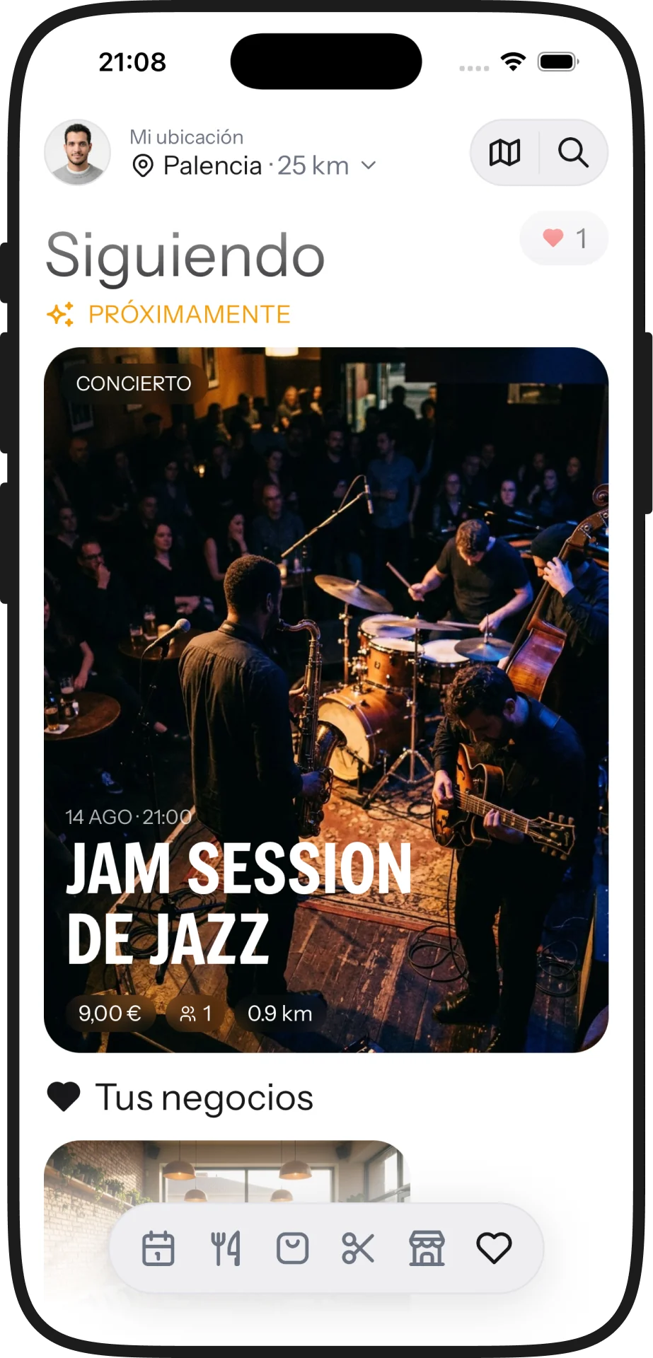
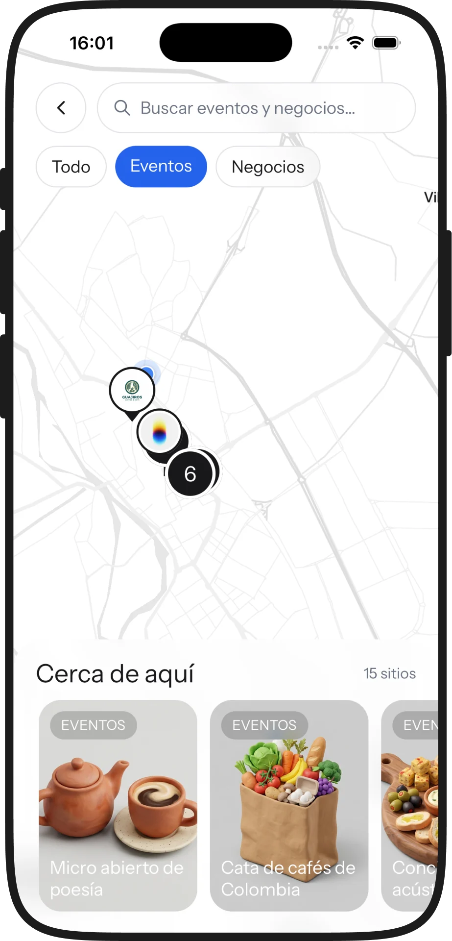
Gigs, tastings, workshops, tournaments. Pick how many of you are coming and the ticket stays in the app: no forms, no confirmation emails to dig up later. And the menu is read before sitting down, with photo and price, which is when you actually decide where to go.
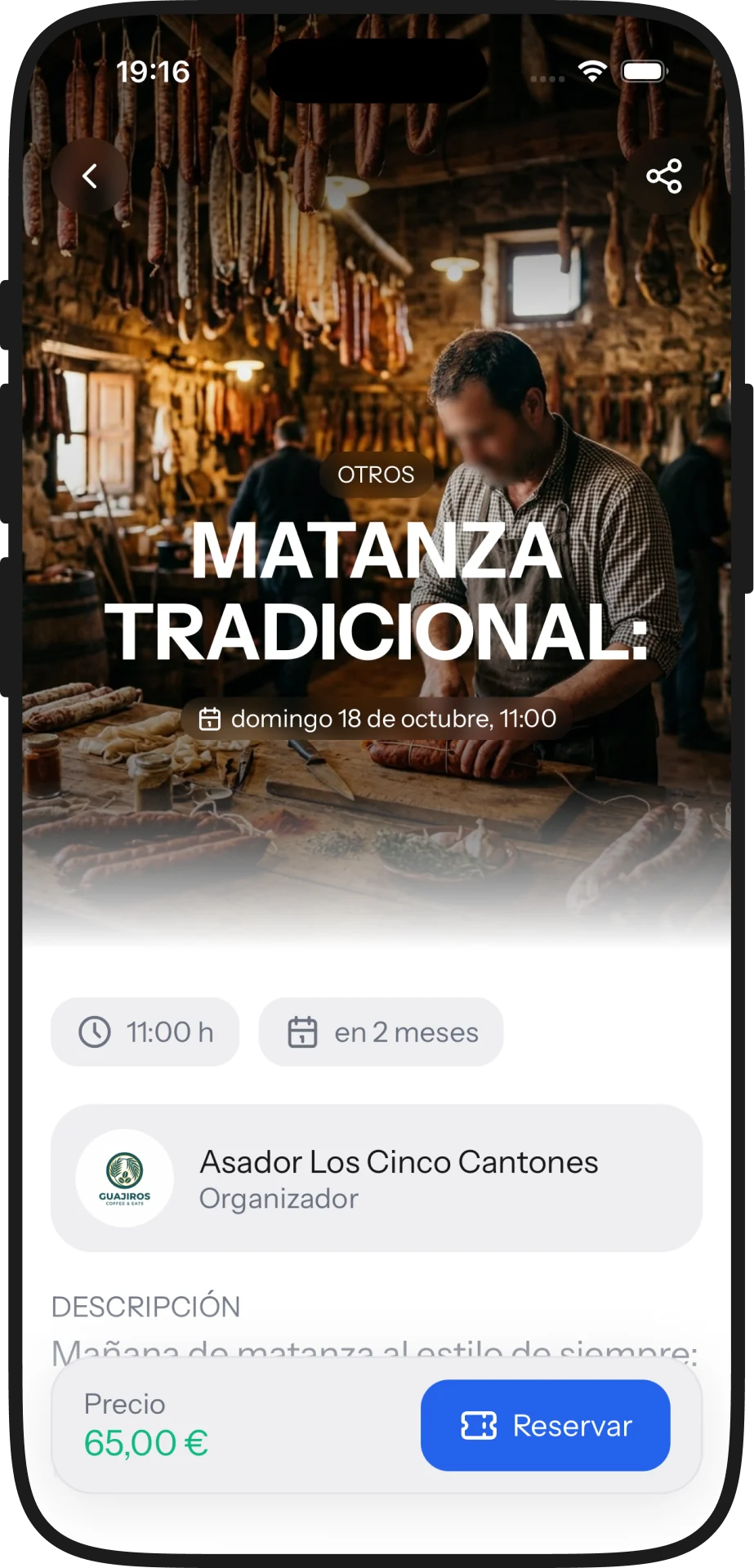
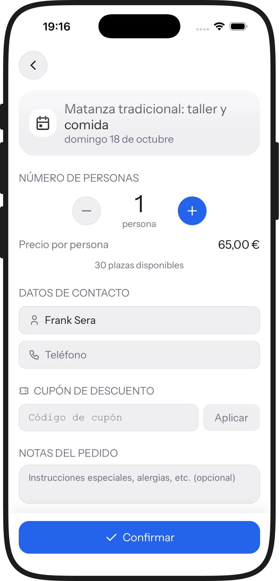
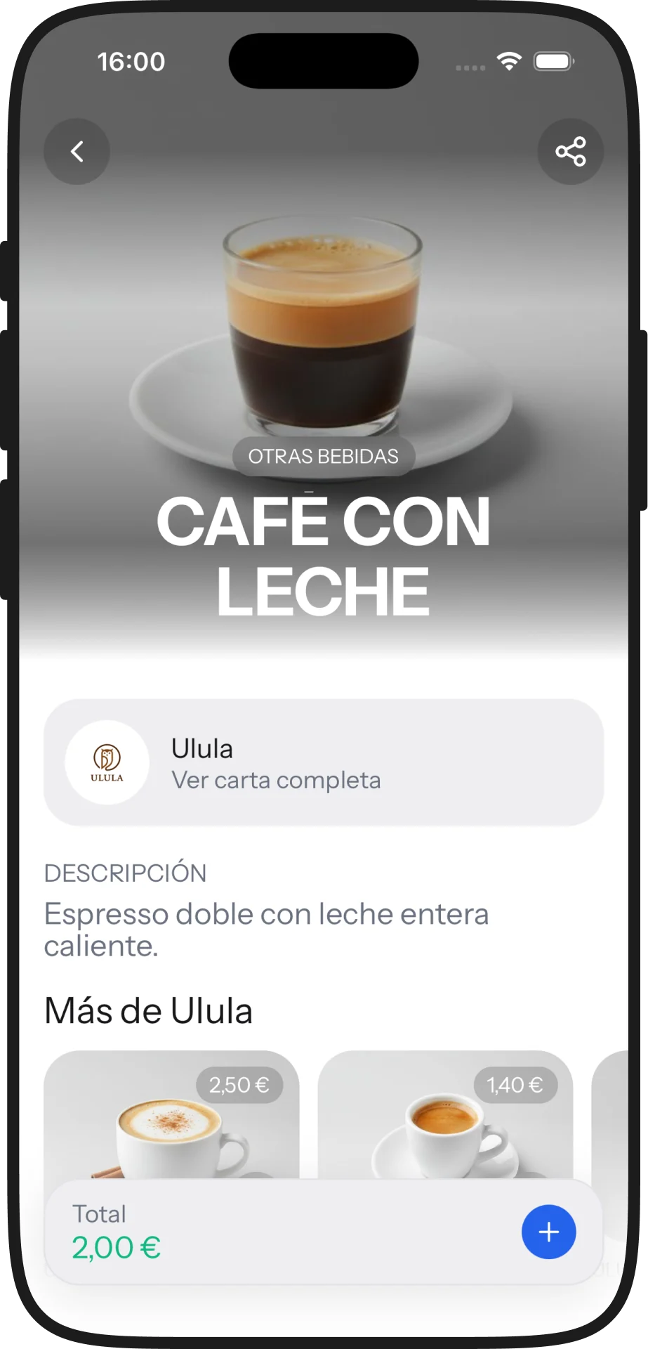
The same app, with room for more
On tablet the navigation moves to a fixed sidebar and twice as much fits on screen: the whole listing at a glance. It isn’t the phone version stretched — it’s the same information given the room it deserves.
- ✓Discovery by location
- ✓Digital menu with photo and price, and ordering from the table
- ✓Events with places and the ticket kept in the app
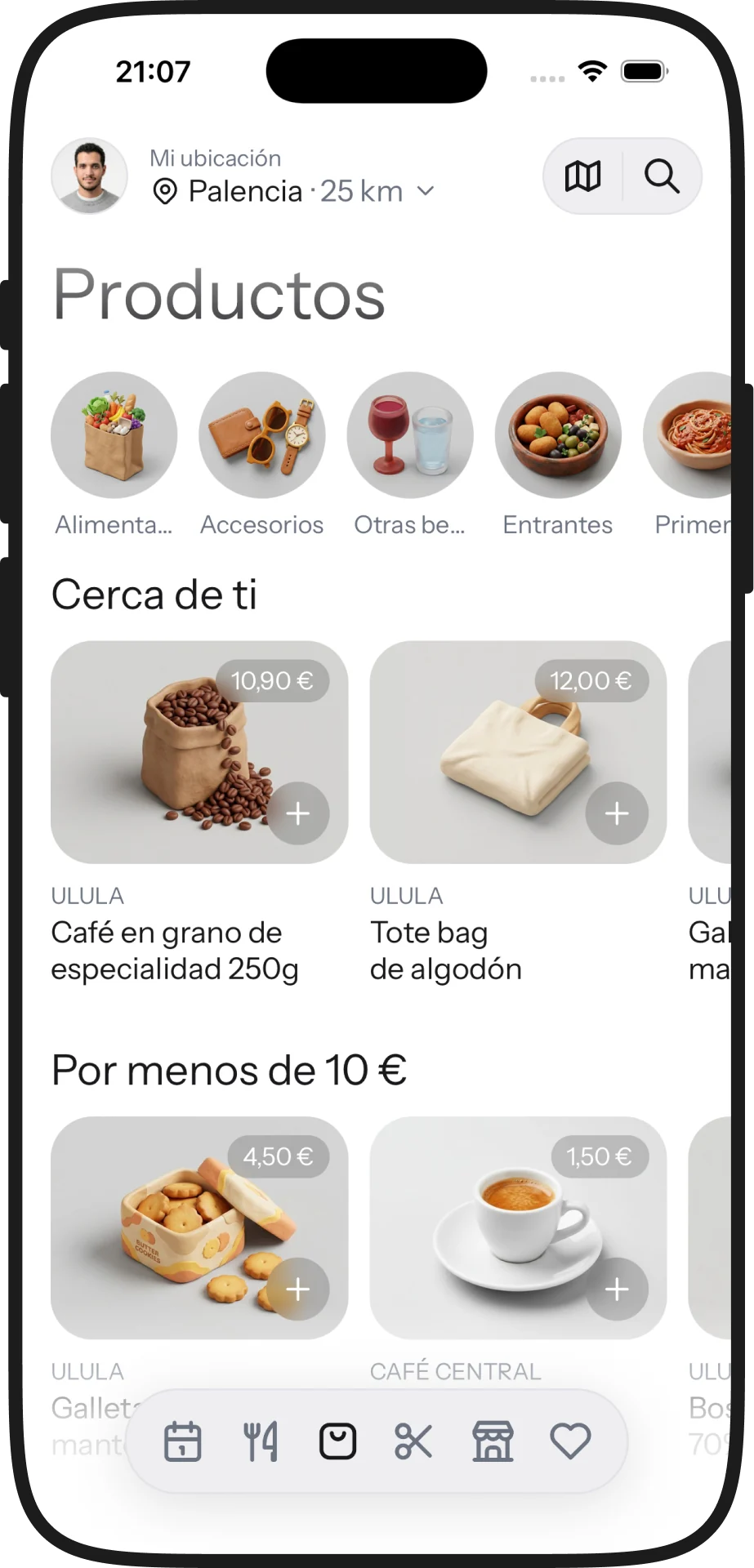
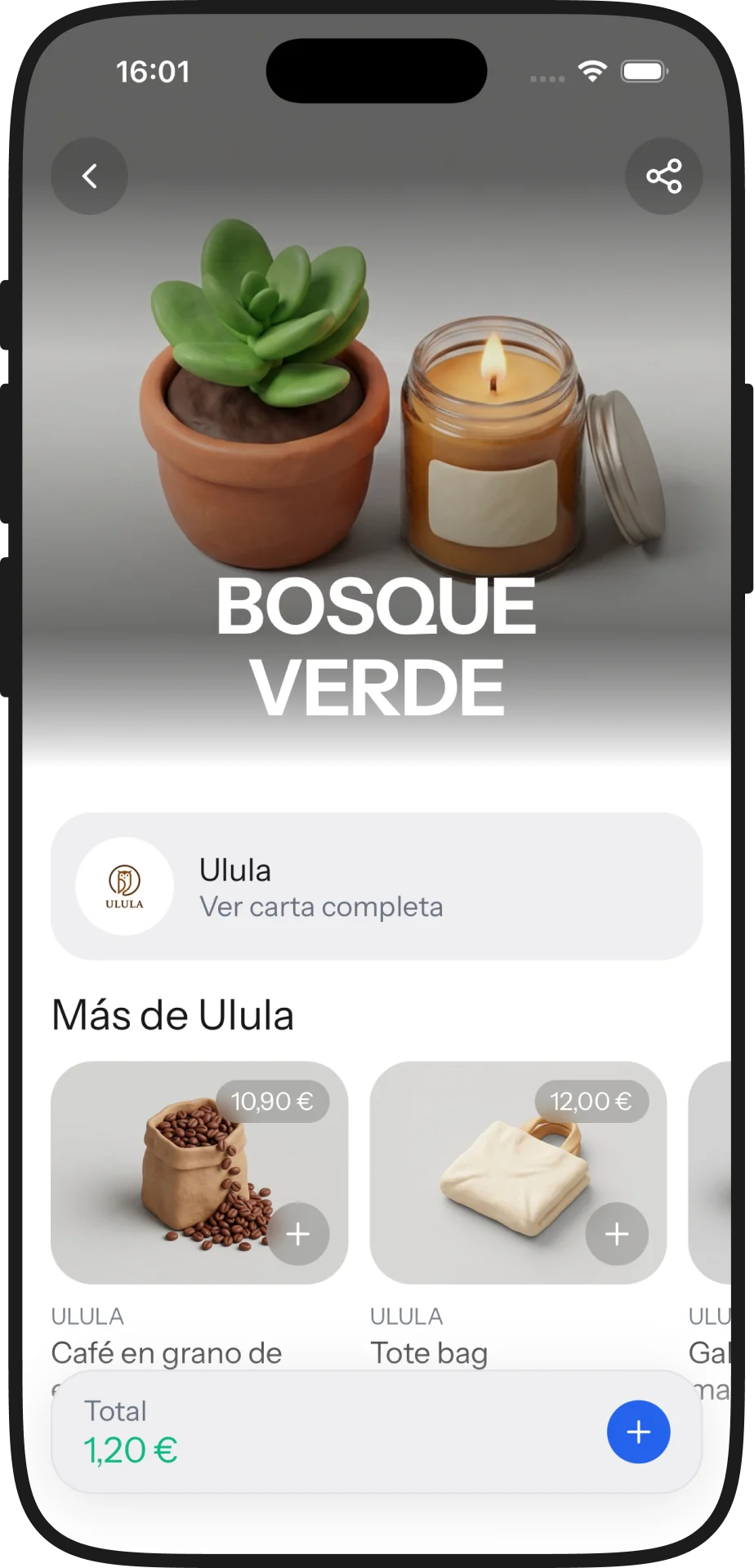
- ✓The businesses’ shop
- ✓Appointments with duration and price up front
- ✓Free, with no booking fee
It shares its backend, design system and account with the rest of the suite. The full context —architecture, integrations, business model— lives in the Ulula case study.
Screen by screen